17 Dec 2025
3 mins
17 Dec 2025
3 mins
The Art of Simple UX Writing
The Art of Simple UX Writing
Discover why 'speaking simply' is the secret to great UX, and learn how to write human-friendly copy that guides users instead of confusing them.
Discover why 'speaking simply' is the secret to great UX, and learn how to write human-friendly copy that guides users instead of confusing them.
The Art of Simple UX Writing
Discover why 'speaking simply' is the secret to great UX, and learn how to write human-friendly copy that guides users instead of confusing them.

We live in a noisy world. Notifications are constantly pinging, pop-ups are begging for attention, and our inboxes look like a game of Jenga about to topple over. In this mess of words, everyone is reading something, all the time. But here is the big question: how many of those words actually help people do something?

That is where UX writing comes in. At Studuo, we live by one golden rule: Speak Simply.
Why? Because good UX writing avoids confusion, but great UX writing avoids effort. When we write clearly, users feel more in control, stick around longer, and get things done faster.

Here is how to master the art of simple UX writing.
1. Guide Action, Don’t Write a Novel
When you are talking to a user, you aren't writing a book. You are guiding an action. If your message makes someone pause and think too hard, they might just leave.
Let’s look at a quick example of how to fix "fancy" writing:
❌ The Fancy Way: “Kindly ensure the documentations are submitted at the earliest convenience.”
✔ The Simple Way: “Please submit your documents to move ahead.”
See the difference? Short, clear, and done.
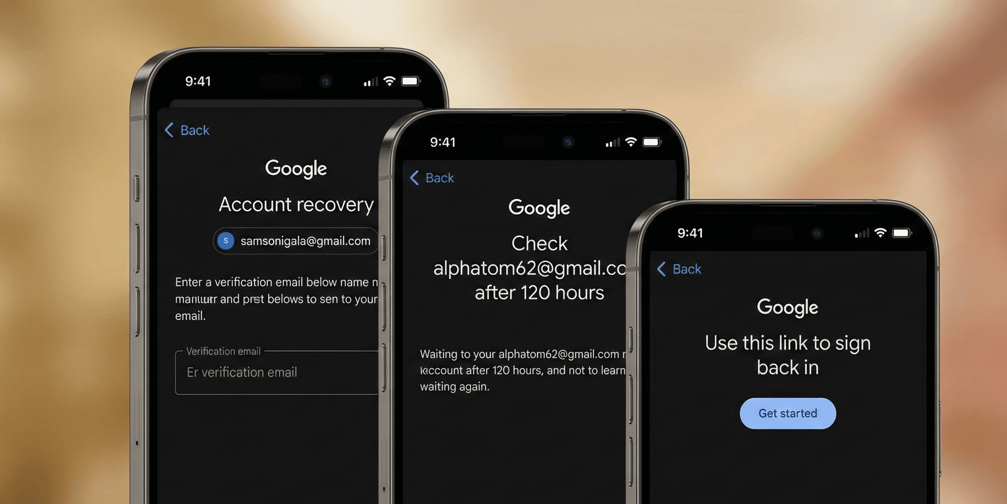
Think about Google’s account recovery process. In a panic moment, you don’t need poetry; you need steps. Google keeps it direct: “Check your email” or “Enter the code”. No fluff, just help.
2. Sound Like a Human, Not a Brochure
There is a big difference between marketing and UX writing. Marketing makes promises; UX gives answers.
Users don’t want to be sold to when they are trying to use a feature.
❌ Don't say: “This revolutionary new feature gives you unmatched productivity.”
✔ Do say: “This feature helps you finish work faster.”
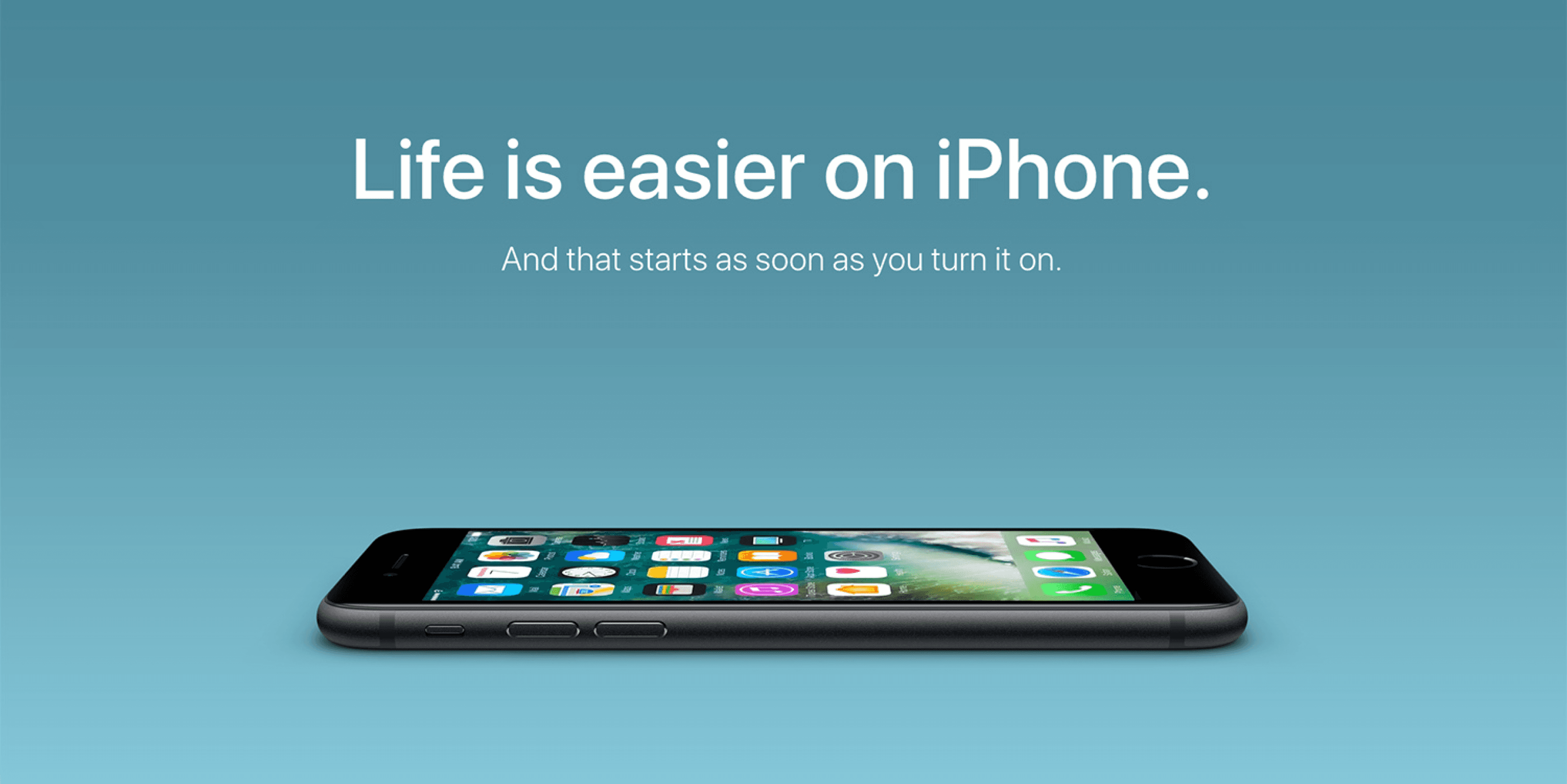
Apple is a master at this. Their settings menus are plain and actionable, never salesy. When writing for real people, you don’t need fireworks—you need clarity.
3. Make Actions Obvious

The goal is to reduce thinking. Users shouldn't have to "decode" your text to figure out what happens next.
Amazon’s delivery tracker is a perfect example of this logic.
Order placed → Shipped → Out for delivery → Arriving today.
It’s obvious, logical, and requires zero mental effort to understand.
4. Write for Scanners
Here is a harsh truth: users don’t read interfaces; they skim them.
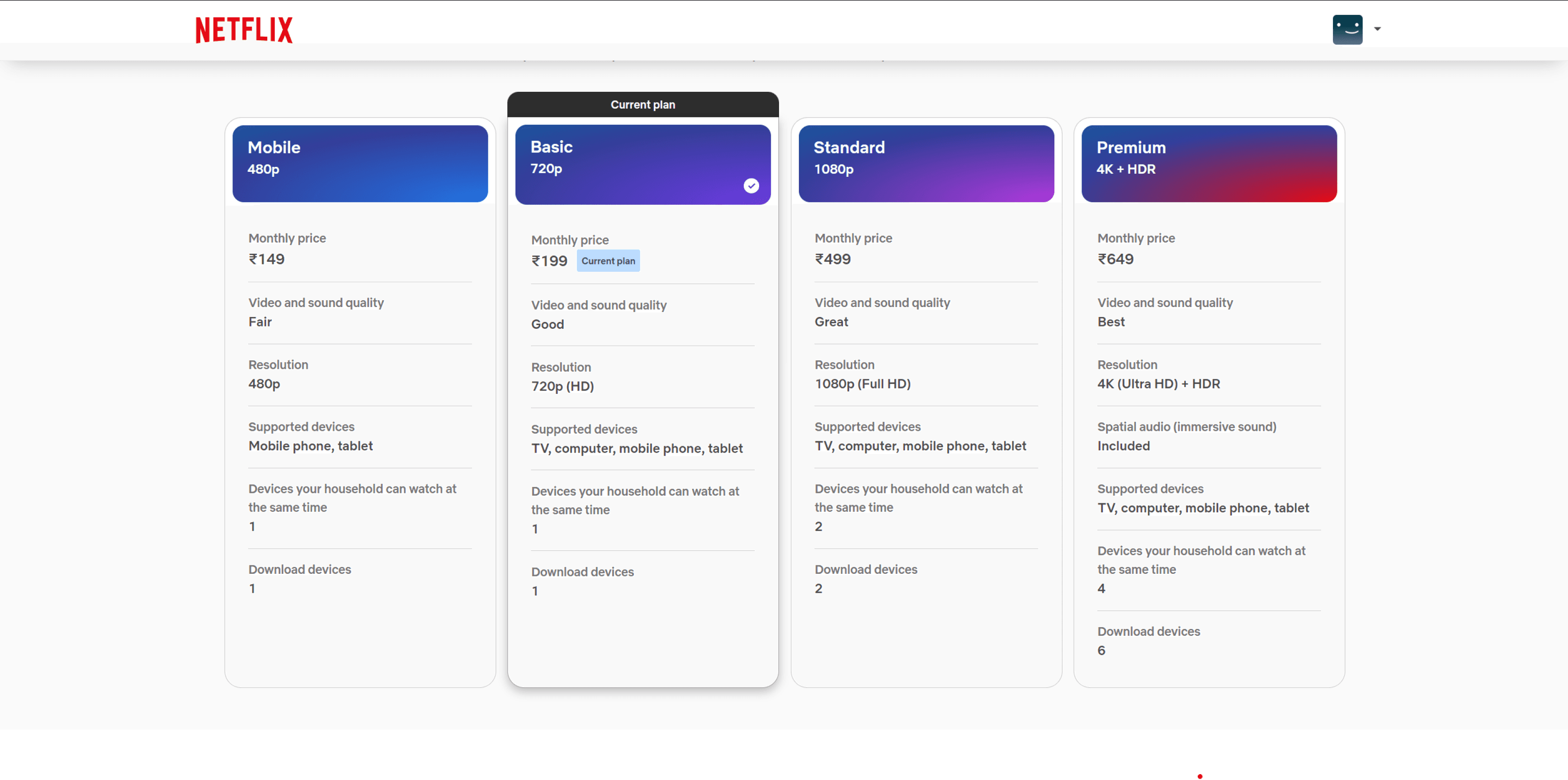
To handle this, you need structure and brevity. Look at how Netflix displays their plans: Basic · Standard · Premium. You can spot the differences at a glance without wading through paragraphs of text.
The "Is It Simple?" Checklist
You don’t need to sound formal to be professional—you just need to sound real. The sweet spot is conversational
Before you publish that new button or error message, run it through this simple checklist:
Will the user understand this instantly?
Can I say this in fewer words?
Does the tone feel human?
Am I explaining something, or am I trying to sell it?
The ultimate test: Can a 10-year-old read this without help?
If you answered "yes" to these, you have written clearly enough.
Final Thoughts
Simple isn't basic—simple is powerful.
Using simple language respects your user's time and reduces their mental load. It helps them do more instead of thinking more.
At Studuo, we don’t use words to impress anyone. We write so users don’t have to struggle to decode a message. We keep it human, clean, and honest so the experience just flows.
And honestly? That is exactly what good UX writing should feel like: easy.
We live in a noisy world. Notifications are constantly pinging, pop-ups are begging for attention, and our inboxes look like a game of Jenga about to topple over. In this mess of words, everyone is reading something, all the time. But here is the big question: how many of those words actually help people do something?
That is where UX writing comes in. At Studuo, we live by one golden rule: Speak Simply.
Why? Because good UX writing avoids confusion, but great UX writing avoids effort. When we write clearly, users feel more in control, stick around longer, and get things done faster.
Here is how to master the art of simple UX writing.
1. Guide Action, Don’t Write a Novel
When you are talking to a user, you aren't writing a book. You are guiding an action. If your message makes someone pause and think too hard, they might just leave.
Let’s look at a quick example of how to fix "fancy" writing:
❌ The Fancy Way: “Kindly ensure the documentations are submitted at the earliest convenience.”
✔ The Simple Way: “Please submit your documents to move ahead.”
See the difference? Short, clear, and done.
Think about Google’s account recovery process. In a panic moment, you don’t need poetry; you need steps. Google keeps it direct: “Check your email” or “Enter the code”. No fluff, just help.
2. Sound Like a Human, Not a Brochure
There is a big difference between marketing and UX writing. Marketing makes promises; UX gives answers.
Users don’t want to be sold to when they are trying to use a feature.
❌ Don't say: “This revolutionary new feature gives you unmatched productivity.”
✔ Do say: “This feature helps you finish work faster.”
Apple is a master at this. Their settings menus are plain and actionable, never salesy. When writing for real people, you don’t need fireworks—you need clarity.
3. Make Actions Obvious
The goal is to reduce thinking. Users shouldn't have to "decode" your text to figure out what happens next.
Amazon’s delivery tracker is a perfect example of this logic.
Order placed → Shipped → Out for delivery → Arriving today.
It’s obvious, logical, and requires zero mental effort to understand.
4. Write for Scanners
Here is a harsh truth: users don’t read interfaces; they skim them.
To handle this, you need structure and brevity. Look at how Netflix displays their plans: Basic · Standard · Premium. You can spot the differences at a glance without wading through paragraphs of text.
The "Is It Simple?" Checklist
You don’t need to sound formal to be professional—you just need to sound real. The sweet spot is conversational
Before you publish that new button or error message, run it through this simple checklist:
Will the user understand this instantly?
Can I say this in fewer words?
Does the tone feel human?
Am I explaining something, or am I trying to sell it?
The ultimate test: Can a 10-year-old read this without help?
If you answered "yes" to these, you have written clearly enough.
Final Thoughts
Simple isn't basic—simple is powerful.
Using simple language respects your user's time and reduces their mental load. It helps them do more instead of thinking more.
At Studuo, we don’t use words to impress anyone. We write so users don’t have to struggle to decode a message. We keep it human, clean, and honest so the experience just flows.
And honestly? That is exactly what good UX writing should feel like: easy.
UI/UX

Does Great UX Design Often Start with Jugaad?
10 Sept 2025
3 mins
UI/UX

Storytelling in UX: Why It Works and How to Do It
5 Jul 2025
3 mins
Branding

Sonic Branding: How Sound Builds Brand Identity
13 Jun 2025
4 mins
Branding

Personal Branding From the Rap Industry
26 May 2024
5 mins
UI/UX

Top 7 Design Systems of 2024
14 May 2024
5 mins
Branding

Unlocking the Power of Consistent Branding
1 Mar 2024
6 mins
Branding

The Importance of Branding for Startups
27 May 2023
5 mins
UI/UX

5 Essential Tips : Design for All Generation
22 Feb 2023
7 mins
Drop in for a coffee
Discover